For 100 years no-one noticed it, but this rebrand finally gives Gunnersbury Museum a reason to be found
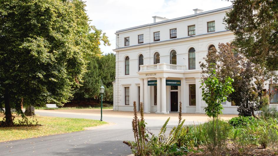
Ask most Londoners what’s inside Gunnersbury Park, and you’ll get a shrug, a mention of the boating lake, or, if you’re really lucky, a vague memory of a school trip decades ago. Ask them about the museum tucked inside it, and you’ll likely draw a blank entirely. That’s the nub of the problem brand consultancy Wiedemann Lampe was handed. A 72-hectare site jointly owned by Ealing and Hounslow councils, packed with heritage buildings, sports facilities, community gardens and an excellent local history museum, yet almost nobody outside the immediate area knew the museum existed at all.
It’s the kind of brief that’s simple in theory but devilishly challenging in practice. You’re not launching something new; you’re trying to make a 100-year-old place legible to people who’ve walked past it their whole lives without registering what’s there. And you’re doing it for two things that are administratively, financially and experientially distinct, yet physically inseparable. Namely, a park and a museum sharing a gate, a website and—until now—a rather muddled sense of what either of them actually stood for.
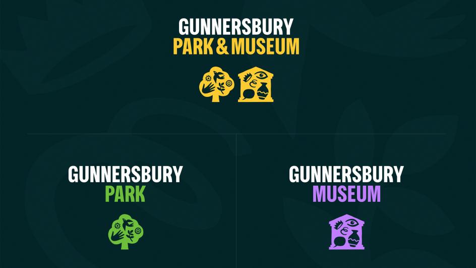
Wiedemann Lampe’s answer was deceptively neat. Stop pretending the park and museum are one thing, but also stop pretending they’re two unrelated things. Build an identity that can split apart or snap together, depending on what’s being talked about, and let colour do the heavy lifting.
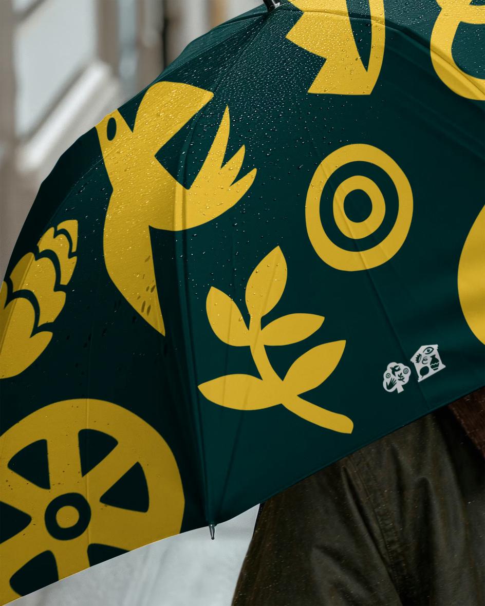

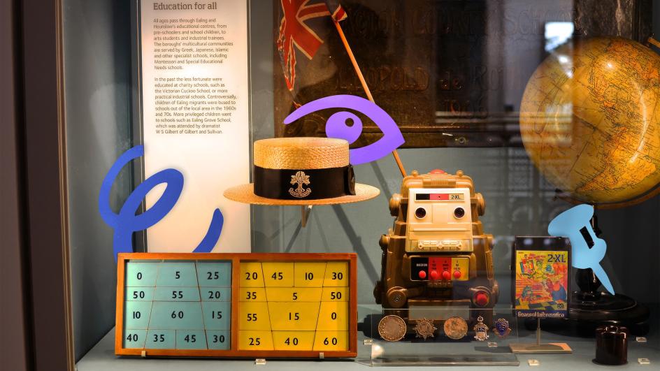
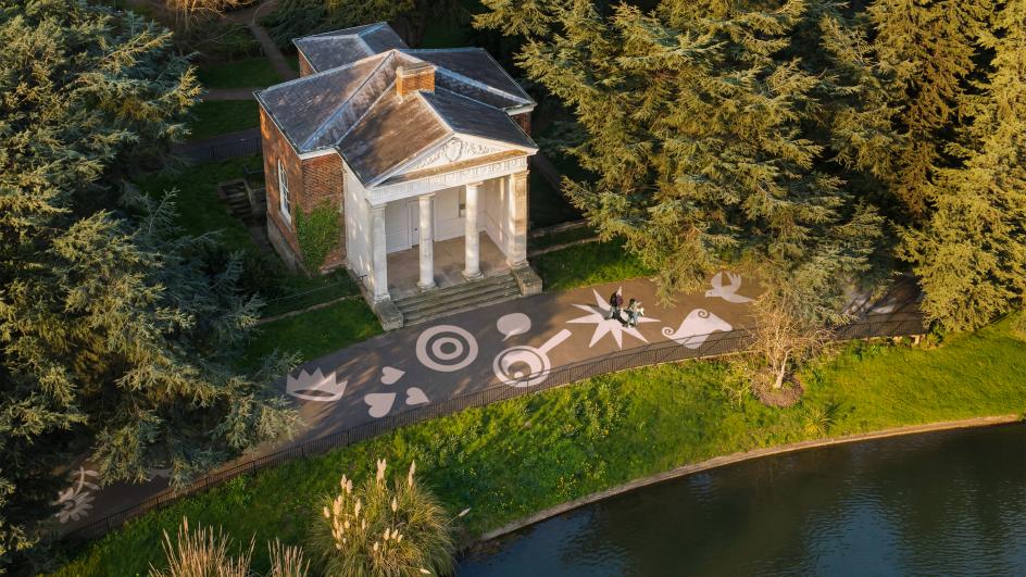
The system hinges on two symbols: a tree for the park and a gabled building for the museum. Each is stuffed with small illustrated details (birds, hands, pottery, an eye) that hint at what’s inside, without over-explaining it.
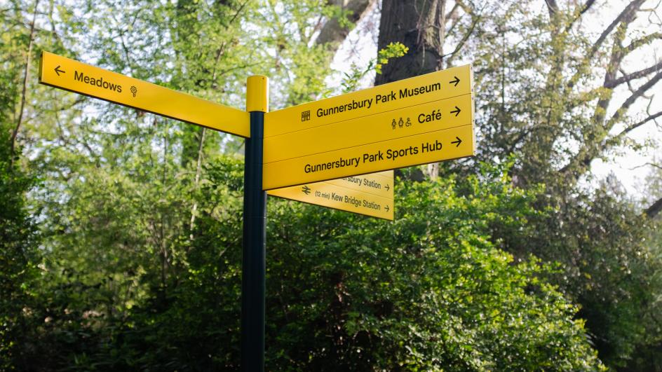
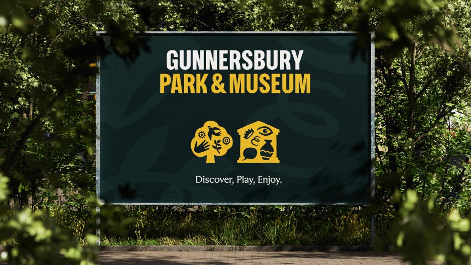
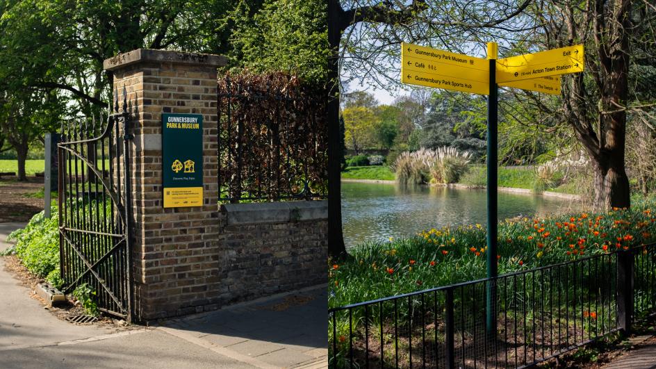
Green belongs to the park, purple to the museum, and when the two combine, a punchy yellow takes over; the colour that then carries straight through into the wayfinding signs dotted around the grounds.
It’s a simple piece of logic, but it solves a problem that trips up a lot of shared-site rebrands: the temptation to design one identity and hope it flexes convincingly for two very different entities. Instead, Wiedemann Lampe built modularity in from the start.
The museum can promote an exhibition without dragging the whole park along for the ride; the park can advertise a summer trail without leaning on the museum’s visual weight. And when the organisation wants to speak as a single entity, the yellow lockup does that job cleanly, without either symbol getting swallowed.
Benji Wiedemann, executive creative director and co-founder at Wiedemann Lampe, frames the challenge as one of growth: the organisation’s team and ambitions had expanded, and the brand needed to catch up. Given how often “growth” gets used as marketing wallpaper in these announcements, it’s pleasing here it’s tied to something concrete: a small, community-interest company (Gunnersbury Estate CIC) trying to punch above its weight with limited resources.
Swerving the clichés
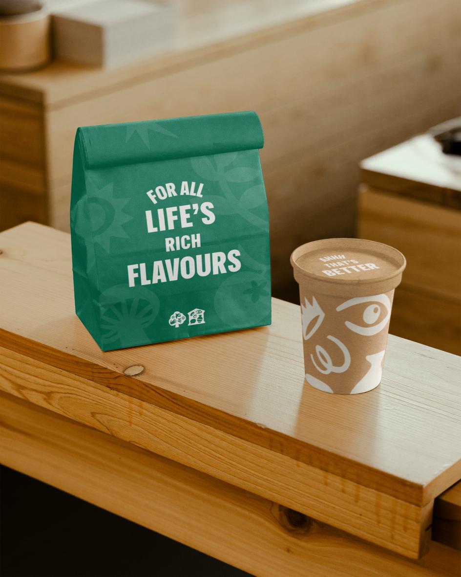
The strategic idea underpinning all this is “Life’s Rich Tapestry”, a phrase that could easily have collapsed into stock-photo blandness (smiling multicultural families, golden-hour park shots, the usual). Instead, Wiedemann Lampe seems to have clocked that risk and actively designed against it.
The photography direction favours intimate, human moments over panoramic vistas. Meanwhile, the illustration suite, developed with artist Rebecca Sutherland, leans into specificity: seasons, wildlife, artefacts, cultural activity, rendered as a flexible, growing library rather than a fixed set of hero images. That’s a smart bit of futureproofing, and arguably the most useful lesson here for anyone working on heritage or civic identities.
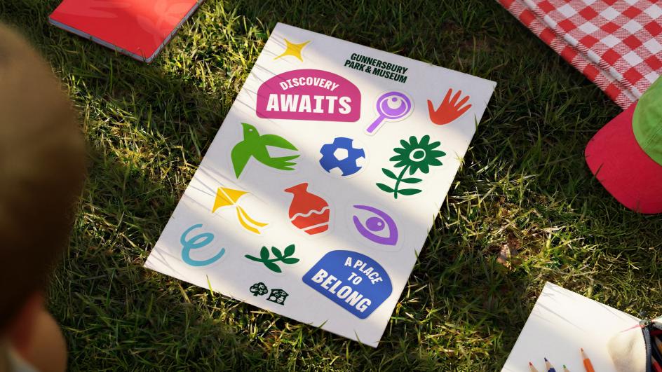
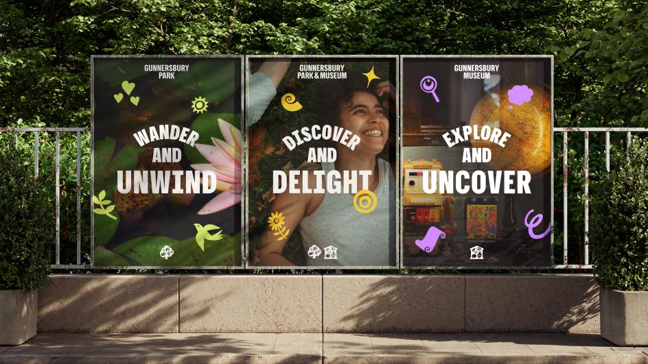
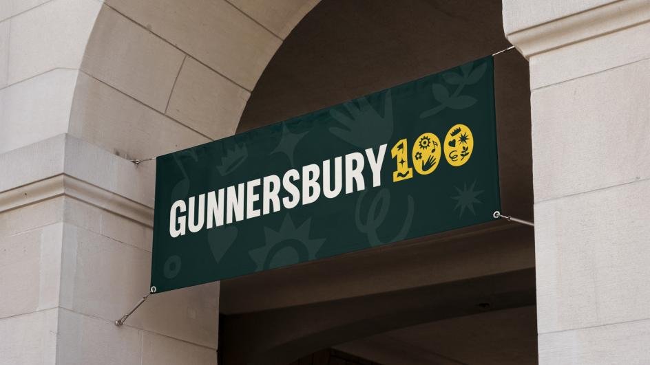
A single hero illustration dates fast and locks an organisation into whatever moment it was commissioned in. A modular illustration system, by contrast, lets Gunnersbury keep adding to its own visual vocabulary as programming changes, without ever needing to commission a whole new campaign from scratch. The Gunnersbury 100 anniversary mark, sitting alongside the main identity rather than replacing it, is a good demonstration of how that flexibility plays out in practice.
Anyone who’s tried to navigate a large, informally laid-out park will recognise the wayfinding problem instantly: too many paths, too few decisions made for you, and a creeping sense that you might be missing the good bit entirely. Wiedemann Lampe’s response avoids the obvious trap of over-directing visitors.
Rather than dictating a single route through the site, the new yellow signage uses a clear, icon-led structure to surface options: the museum, the café, the sports hub, the nearest station; all legible at a glance, but the choice of where to actually go stays with the visitor.
It’s a subtle distinction, but an important one for any place-branding project: wayfinding that empowers exploration reads very differently to wayfinding that herds people. Given Gunnersbury’s ambition to be seen as an inclusive, communal space, that feels like the right call. And it’s backed by practical thinking too, with the system built to roll out in phases as budget allows, rather than demanding a single, expensive big-bang installation.
David Bowler, chief executive of Gunnersbury Museum and Park, talks about the rebrand “galvanising” a small team, which is as good a measure of success as any client testimonial can offer at launch stage. The harder test comes later: whether that confident yellow signage actually gets more people through the gates who didn’t know there was a museum. For an organisation that’s spent a century working quietly in the background, that’s the real ambition here: not a nicer logo, but permission to finally take up space.
🔗 Source: Original Source
📅 Published on: 2026-07-30 09:02:00
🖋️ Author: Tom May – An expert in architectural innovation and design trends.
For more inspiring articles and insights, explore our Art Article Archive.
Note: This article was reviewed and edited by the archot editorial team to ensure accuracy and quality.