Brand Ethos and Becolourful design identity for new charity Waythrough
Independent design agency Brand Ethos and brand voice specialist Becolourful are behind the name and visual identity for Waythrough, a major new charity set up to support vulnerable people through their recovery journey.
Formed through the merger of two established charities—Richmond Fellowship and Humankind—Waythrough will work in mental health, alcohol and substance use, gambling, and housing. Their service will focus on a holistic approach to recovery and supporting people throughout their journey, which is unique in the sector and something the agencies wanted to get across in the branding.
Brand Ethos co-owner and brand strategist Peter Mills saw it as a really exciting opportunity to combine their skills and experience in charity branding, health and care, and create an identity for “a charity doing something courageous with real-world impact.” To ensure it would resonate with those who need it the most, the creative team made extensive efforts to understand the lived experience of people using recovery services.

Mills says: “Throughout the project, careful consideration was given to the most vulnerable audiences, and they were the priority in every decision from name to photography.
“Employees and stakeholders were also an important audience as the merger progressed and two cultures became one.”
Everything from the new name to the visual and verbal identities needed to introduce the new charity and its approach in the right way and make clear why it is different from others in its sector.
According to Mills, taking a collaborative and iterative approach to the project was key, as it meant that any challenges were collectively resolved.
“We agreed on a series of working and reference groups that helped steer answers and inform our thinking, both strategic and creative,” he says, adding that they had a lot to achieve in a relatively short time, with a hard deadline for the handover of assets to the web agency and for launch.


Naming is always challenging, but the charity needed something to tell its story and communicate that Waythrough would be there all the way through the journey.
When it came to the brand architecture, Brand Ethos had to consider that both previous charities had developed numerous projects and services over the years, including social enterprises, often with their identities and logos. “A lot of these were well regarded and even loved,” says co-founder and design director Lisa Cromer, and so Brand Ethos sought to develop a new brand architecture that met both “the practical on-the-ground local requirements and the need to reflect positively on the wider reputation of the charity overall”.
Cromer says: “The challenge was to blend pragmatism with the needs of a wide range of stakeholders.
“A comprehensive decision tree ensures that future branding projects have a clear direction and meet the requirements of a complex web of stakeholders.”

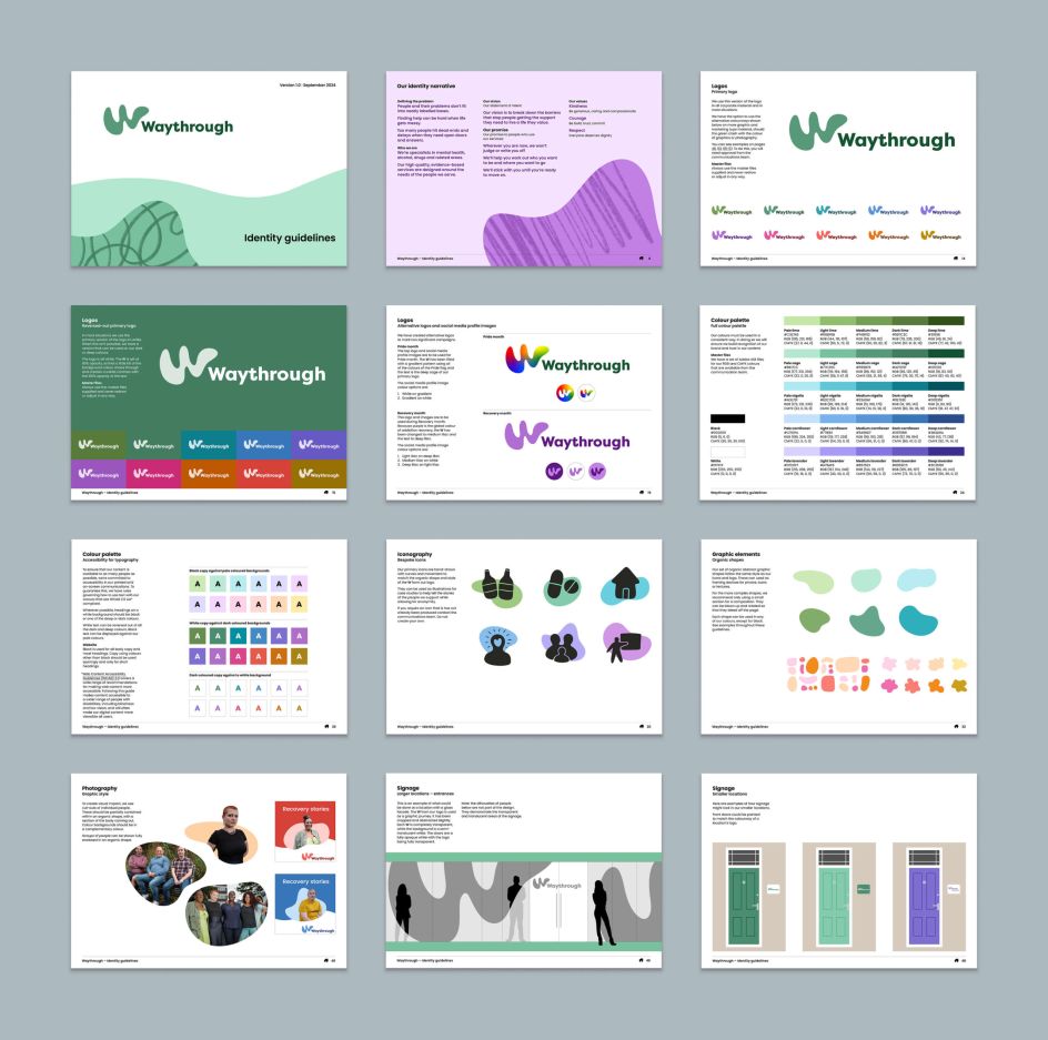
A concept for the logo came to the design team quite early on and immediately resonated with most stakeholders, which left only the challenge of how to make it fresh while working for the service brands. “This problem was overcome with a wide colour palette from which services could choose,” says Cromer.
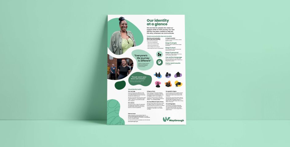
Hand drawn icons, organic shapes, journeys and textures and portrait photography are also part of the new Waythrough brand identity.
“With the name and identity speaking to the experience of those who use the services, understanding of the new charity and its aims have been positive, and people and partners have been in touch with the charity and want to be involved,” says Mills.

Waythrough’s director of communications and external affairs adds: “The response from staff has been really positive to the name, brand and colours.
“We are only taking our first steps with the new brand, but having now launched it to the world, and most importantly, our colleagues and the people we support, we can see how it will work as an enabling platform for our future vision of truly organising support around the people we serve.”
🔗 Source: Original Source
📅 Published on: 2024-12-17 09:00:00
🖋️ Author: Abbey Bamford – An expert in architectural innovation and design trends.
For more inspiring articles and insights, explore our Art Article Archive.
Note: This article was reviewed and edited by the archot editorial team to ensure accuracy and quality.


